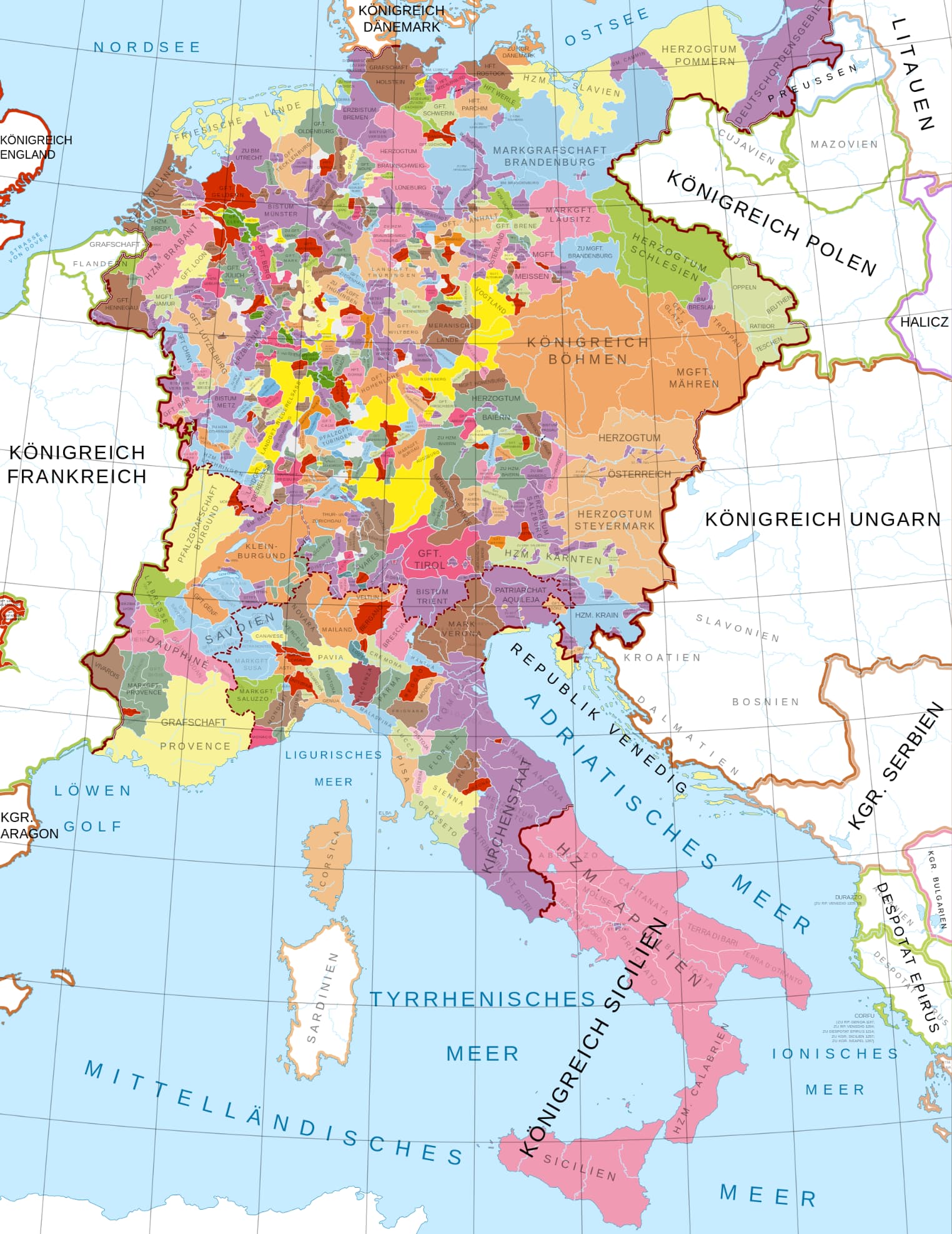
I think my first port of call would be to shrink the labels. If you compare OHM’s labels for both countries and states with OSM’s the ones on OHM are both larger and darker; OSM also doesn’t render the states in all-caps.
View Larger Map
The size of the labels at the moment is really just a bit too big for even medium-small countries like the Netherlands; really small countries like Liechtenstein or even worse the 19th-century Thuringian states just get lost under the text. It would be a shame to totally change it though as I do like the label style when applied to larger entities (e.g. France or the Austrian Empire).
It might also be a bit better if the borders themselves were a bit less “sharp”/“dense” – they go very quickly from dark to light and almost look like anti-aliasing is too low. I suspect this is a result of multiple pieces of the same geometry overlaid on top of each other – I don’t really know how the renderer handles it, but it does seem to make darker borders when two or more entities share the same boundary (or at least it used to). I think OSM gets around this by drawing the way itself and defining the boundary type on the way, but that’s probably not feasible for OHM (maybe with multiline relations), so some system which only draws one iteration of a boundary way would probably be useful (e.g. draws it only at the highest admin_level).
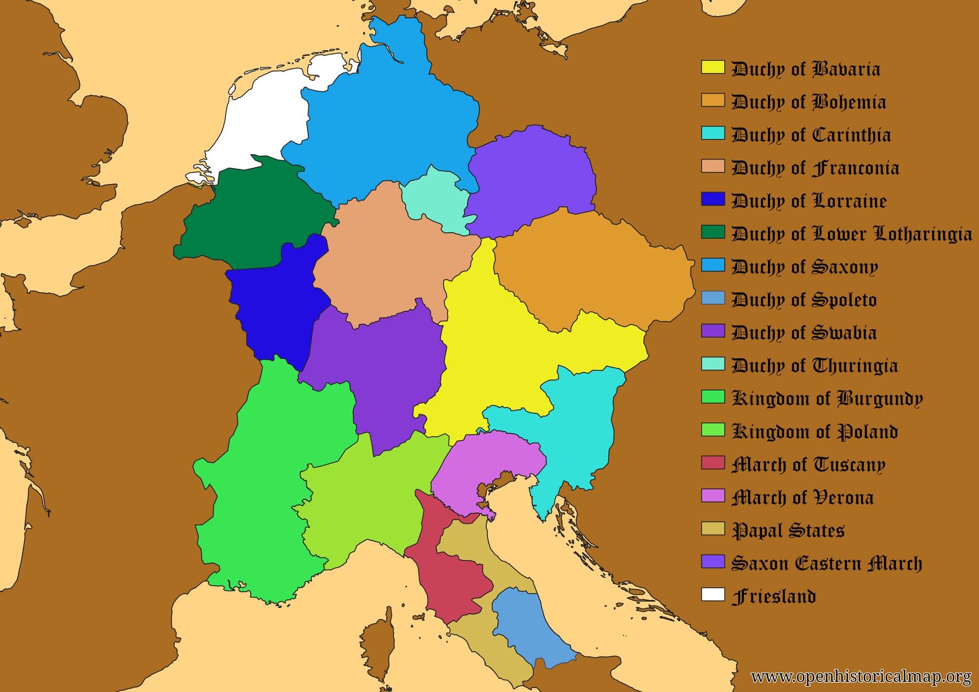
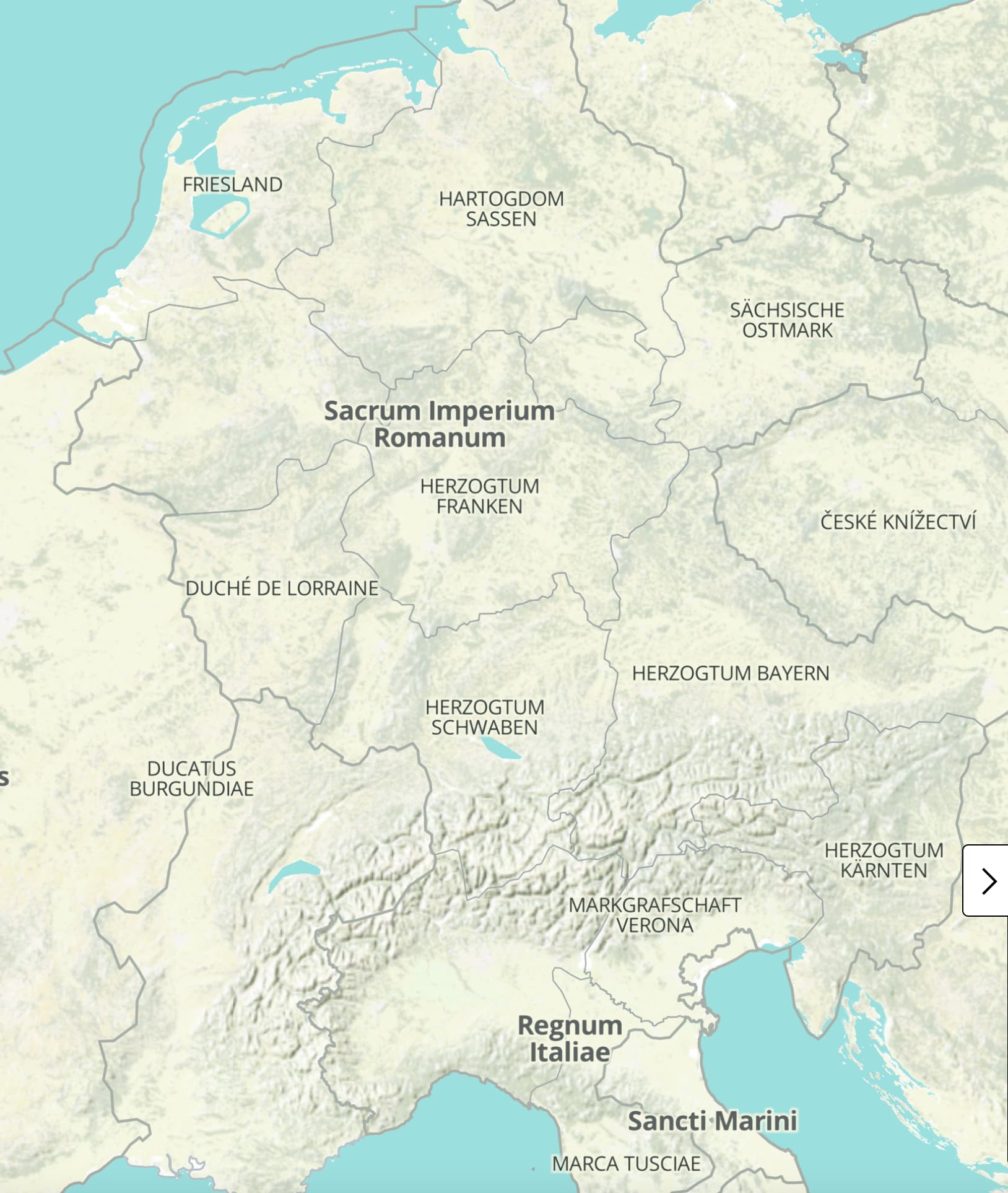
It might also be worth looking at whatever system is used to simplify the geometry at different zoom levels. Given the complexity of some of these boundaries (example embedded below), if the “simplifier” (or whatever you’d call it) can’t simplify that down adequately it’s no wonder the borders look messy. Other than that the only thing I can think of is somehow manually defining zoomed-out geometry or tagging using a role to tell the renderer to only use it when zoomed in (e.g. outer_complex).
View Larger Map
The way OHM handles land use may also be contributing to the apparent “messyness”. Currently there isn’t much in the way of land use mapped, but in Germany and Austria there are large areas of woodland/forest mapped. When zoomed out, this is rendered as grey or grey-green, on top of the grey topographic shading and with dark grey borders and text on top – visually not very appealing and quite “noisy”. OSM, in contrast, uses a muted purple for its boundaries and text and woodland remains green throughout. I wouldn’t say it’s pretty exactly but it is certainly visually clear and fairly functional in a way OHM is not.
Styling aside, we could maybe only render labels for large entities (relative to the zoom), possibly using the same (or similar) system that determines where to place labels automatically, or with a specific tag (not ideal but not really worse than using a label node).
There could also maybe be abbreviated forms for some names that display if the “full” label is too much bigger than the geometry (where appropriate). For example, at a far out zoom (e.g. 2) the UK could display, well, UK, at maybe 3–5 United Kingdom, and any closer United Kingdom of Great Britain and Northern Ireland. If I were making a static map I’d probably be tempted to use multiple text sizes for the latter, e.g. United Kingdom of Great Britain and Northern Ireland, but I don’t know how that could be tagged and would very much be “tagging for the renderer”.
While on the subject, having more than three types of label (~country, state, county) would be very useful. The needs a country like the US are vastly different than one like San Marino, so a one-size-fits-all “country” label doesn’t really make sense. At the same time it often seems to be the case that multiple levels of subdivision use the same label type so reading the map becomes quite difficult.
Another possibility for some cases might be to somehow group adjacent small states together (e.g. the Thuringian states, the Duchies of Anhalt) such that they either show up as a collective unit when zoomed out or have finer borders. Obviously this would not impact their larger neighbours. You’d have to be careful to make it clear that they weren’t actually in some kind of confederation or something though. This would also only work for cases where there is some logical/reasonable grouping.
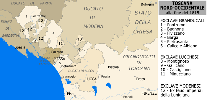
Rather than Germany, I think a useful place to consider is Lunigiana in Italy. Until the 1840s was a mess of territories held by Modena & Reggio, Massa & Carrara (until its 1836 union with Modena & Reggio), Tuscany and Lucca, on the borders with Parma & Piacenza and Sardinia/Piedmont (and not far from the Papal States). These territories are small and many are (geometrically) quite complex so without colours and/or labels they become an unintelligible mess. Crucially though they are all (apart from Massa & Carrara) attached to moderately larger states, and whatever is done has to work on these exclaves as well as it does microstates.
View Larger Map
Coloured map:
That really depends how far back you go and what specifically you’re talking about. Borders in the 18th century were absolutely “crisp” (mostly); medieval ones not so much. Influence on the other hand is variable even today – many states “claim” territories they don’t control. One thing that does hobble us somewhat is the use of simple multipolygons since it means we cannot define specific types of border segment (this is also an issue for things like disputed territories). How one’d go about mapping e.g. the HRE’s mostly nominal claim to Italy I don’t know. Fundamentally these things are just too complex to be captured by outlined multipolygons.
It’s also worth noting that the time period you’ve linked there (1837) is not during the HRE, and the borders then were pretty much as well delineated as they are now (at least in Europe).
Here’s an embedded view of 1775:
View Larger Map
Since this is an embedded version it does not include “state” labels at that zoom (for whatever reason) but it too is quite messy on the site (zoom in a little and they start to show up). Without the labels though it just looks quite dense with divisions (which it is).
Another thing it does raise though is the question of how fiefs and imperial territory held by sovereign states should be handled. So far I (and others) have simply used overlapping relations at admin_level=2 (one for the HRE/overlord, one for the other state) but strictly speaking this isn’t accurate, as it implies that the fief-holder is sovereign; on the other hand, to not include the territory would probably be worse. In the embedded map the most obvious example is the Kingdom of Prussia, which holds many territories including Brandenburg, Pomerania, Magdeburg, East Frisia, Mark, Cleves etc, but Sweden also has some fiefs (western Pomerania, Wismar) and Savoy (held by Sardinia) is also imperial; the Habsburg monarchy is not yet mapped and the UK’s relationship with Hanover and Denmark’s with Holstein aren’t represented either. Several non-sovereign states hold territory in both the HRE and France (mostly in Alsace, e.g. Hesse-Darmstadt)
The thing is, the map probably should be messy to a degree as, to be frank, the whole area was a mess. We’re at a real disadvantage here compared to makers of static maps though as we can’t really use colour and any geometric simplification has to be done automatically.
Take this map of the German Confederation for example: 
It obviously simplifies much of the geometry, does not include any topology or subdivisions, uses a different colour for each state and uses highly abbreviated labels for many of the smaller states (esp. in Thuringia). The text is also quite small and the borders quite fine (which it can get away with without subdivisions and by using colour). Even then it is quite busy in places.
P.S. Something else I’ve noticed: several of the labels in those embedded maps are different than when viewed on the website. They seem to be using English translations (presumably taken from name:en) rather than the standard native text in name, which for several of those states is abbreviated, e.g. “Principality of Waldeck” shows as “Fsm. Waldeck” (for “Fürstentum Waldeck”) on the website but not when embedded. If that is different I do wonder if anything else differs between the site and the embedded version.