I tried to make a logo, it’s similar to that of OpenSeaMap and resembles the iconic magnifying glass ![]()

4 Likes
I like the idea of using the knob of a stopwatch to mimic the handle of a magnifying glass – a bit less clunky than the prototype I shared earlier.
What do folks think about the brown or sepia color scheme? We’ve had several concepts that straight-up depict what appear to be old maps, but I wonder if making too strong an association with old maps in the logo would create some confusion about our mission. After all, we’re actually building a new map, based on more powerful technology than is normally used to produce historical maps, and in some sense more modern than OpenStreetMap too. We consult old maps routinely but aren’t principally engaged in collecting and disseminating them.
What about representing OHM’s progression of time by using the progressionof transportation over the ages…Start with a footway followed by a length rail ending in carriageway. The transformation could move across the square in some direction.
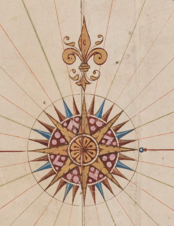
I’ve done some further research. Maybe a compass rose could be a good central element, I’ve find a lot of compass rose on old maps.


I also think that a old representation of a citadel could be a good central element


Maybe around a “O” letter or something else (I’ve speedly do a montage with the previous image)

1 Like
@Koreller - love those and love walled cities. Even if we don’t end up using those designs for the logo, I feel like we ought to have some sort of project or OHM-based gallery for them.
Separately, I’ve seen a couple of designs that I think are both vague and interesting (weird combo?) and possibly a source of inspiration:


And a few mashups of Noun Project logos:
(These are a bit… harsh? … but I wanted to seize on the timeline angle & I do like the “M” created by the 3-fold map, but it may be a bit wide)


1 Like
Ok, last few… promise… (broken with the magic of post editing…)


12 point (like a clock), semi-global thingie with Os, Hs, and Ms in the mix…

MidJourney:

In spite of some amazing brainstorming and creations from the community, it doesn’t seem (to me) like we have any clear winners or consensus crowd favorites. If anyone feels otherwise, please speak up.
Otherwise, we’ll be reaching out to some of the OSM usual suspects when it comes to logo design. If you know of anyone in your network with logo design skillz, please DM me to put us in touch. We’d definitely like to get our logo into better shape and more suitable and stylish for representing our great contributors!!
@jeffmeyer asked me, as an artist, to weigh in. Unfortunately, I’m not the right kind of artist to work up a brand identity for OHM. The project needs someone trained in illustration or graphic design and I’m an experimental media maker without commercial art skills. A few thoughts, though, after skimming this topic.
There are individuals and small shops using the NACIS slack who have cartographic as well as more general design skills in-house. I deeply dislike “for exposure” projects but I’m happy to mention this project there, especially if there is a budget. Being mid-semester, the timing is not great but it might be worth approaching universities/colleges/academies with illustration/branding courses to take this on as a term project. In the Bay Area, California College of the Arts and the Academy of Art University would be appropriate institutions but every major city has at least one school of the arts. The logo and variants do need to work online, in sizes ranging from favicons, sig files, avatars, and full width banner ads, and I can imagine there will be uses in print (from posters to journal articles to conference brochures).
I do like the way @Frying_Pan replaces the magnifying glass with that ringed stopwatch. OHM’s identity needs to make explicit reference to time and this riff pays homage to OHM’s roots in OSM while emphasizing the dimension in which it breaks from it.
And I don’t think 2024 is the time to be grounding a logo solely in Greco-Roman architecture, European woodcuts, or other predominantly Western iconography. I also find sepia-tone, crumpled paper, or other “agings” silly and would rather we trumpet our ability to animate through time in a way static, paper maps cannot. In principle I’m not opposed to abstract logos but there’s such a visual component to what’s been built that it seems a shame to not try and showcase it.
Hope there’s something useful in there.
2 Likes
I realise I’m arriving to this conversation late, sorry if this has already been decided on in places that I haven’t seen. I realise I have always supported OHM in spirit more than in practice.
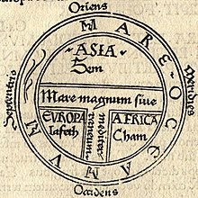
If the aim is for a modern representation of the world as it was historically then it might make sense to use something along the lines of “modernised” T&O map or one of Ptolomy’s projections rather than trying to represent age via materials that look old.
T&O Map:
Something that could be neat if OHM used T&O configuration as a base is that if the orientation is rotated from a traditional East up arrangement to a modern North up arrangement then the stem and crossbar of the “T” shaped bodies of water could have a second use as the right half of an H with the left part outside the circle and possibly rendered as a way with nodes (like the JOSM logo but without the big pencil). Symbolically this would be the modern extension of historical maps. I have attempted to mock this up in Inkscape but my atrocious (lack of) artistic skills mean it doesn’t get anywhere near what I have in my head, so I think this is best omitted here.
If there is a desire to keep the pocket-watch motif this could be worked into world ocean bordering the known world (as it was known then).
As I wrote this post some of this is ringing a bell in my head, so sorry if I’m regurgitating something half forgotten from another discussion.
3 Likes
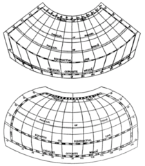
Having never previously posted in this forum before I’m only able to embed one image, so here’s the image of Ptolemy’s projections that I wanted to include above. These were used late enough that there are used in maps that include the Americas so a “background” map in this style may evoke an old fashioned feel for some people even if they don’t know why.
Ptolomy’s Projections:
2 Likes

Just two I18n considerations (I18n = internationalization)
- A (looking glas) handle on the bottom left should be avoided because it urges the user to grab the looking glass with the left hand –– a nogo for CJK cultures.
- Time does not flow from left to right for all cultures. RTL writing orientation might have the past on the right side, mentally.
==
Personally I like the cuneiform strokes. But it is too early for me to have an educated opinion. I have just earned 3 badges: Welcome, Basic and Editor. “Talented icon designer” or “Brand Manager” is not yet on the list.
1 Like
![]() maybe… maybe…
maybe… maybe…
I like the clock face motif. Wondering if may be better with markings instead. Especially if they went from aceint to modern. For example , the first three would be simple dashs to represent a sundial. Next set or quarter would use Roman numerals. Seven to Nine would be cursive Arabic numerals and the last set would be a binary to represent modern digital age.
2 Likes
Bit late, but why not using an hourglass instead of an watch if the a watchclock might make problems with RTL-writing?
Other than that, i like the idea from @IanH with changing the the markings on the watch-face.
1 Like
I think we really have to keep an eye on the branding around other historical GIS projects, because it’s such a crowded field. Fortunately, Open History Map has a garish logo that few will confuse with anything we come up with. It doesn’t even resemble a mantle clock, as I had come to assume.
Since I wrote this, OldMapsOnline.org relaunched with a new logo, which ties together abstract geometric elements that could be interpreted as a compass or clockface and globe. This summer, OMO’s slick launch event at Stanford practically berated the audience with an animated version that has the fleur-de-lis spinning around the globe, like the dial of a compass or hand of a clock.
There’s already real confusion about OMO being an open source project – it isn’t. And I don’t know how well people can distinguish that site’s focus on indexing old maps with our focus on creating new old maps. I wouldn’t completely rule out a logo that uses similar iconography like a stopwatch or compass, but it does add to the challenge of standing out.
With respect to the “insertion point” concept, I just mocked up a Doric column because it was easy to draw, but columns were a staple of many cultures in antiquity. For instance, we could make its capital more floral, like an Egyptian column, or do a whole series of logos with different column styles in the same motif. But really, anything architectural could go between the two arrows and it would still have more or less the same symbolism.
I went for a minimalistic design for the OHM business cards I’ve started handing out. It seems to work well, but a logo would be a nice addition.
It may be worth setting up https://contribute.design/ and maybe get someone to help with the design? Its an initiative to make it easier for designers to help projects.
Also, I found an job-board for open source projects as well - https://opensourcedesign.net/
Self-Made stuff can get checked with Logo Lab - Test Your Logo to get some ideas. Also, there are some guys on reddit from time to time that try to make logos or give away logos (although already made will probably not fit ![]() )
)
As an entrance point for some (good and bad) ideas maybe its worth trying out this tool a bit Brandmark - make your logo in minutes
Also, my tries, although the second one turned out way worse than i thought. (Espacially after looking at your tries above in the thread ![]() )
)


3 Likes
@Vadisadan I like your first logo. However, I find that logo’s are very much recognizable by color. Such as this: