Hi!
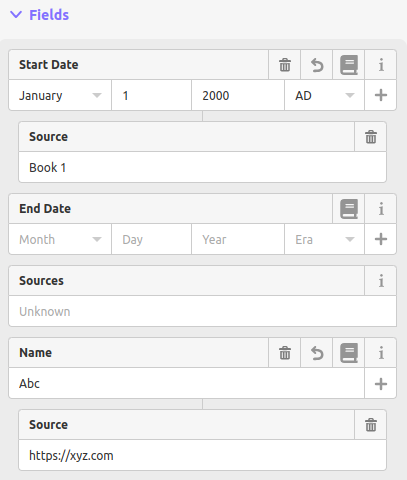
I’m proposing a new set of fields to help users use the *:source subkeys. The idea is to add a button to each field that can be clicked to create a new “subfield” of the main field called “Source”. This field maps to the *:source key, e.g. name:source
I have made a pull request to OpenHistoricalMap/iD where this field is implemented. It’s still a draft, because I haven’t written tests for the feature yet, but it can be played with locally.
I’m open to feedback! Do you think the design is ok? Is my code style ok? Do you think this update is useful at all?
(The main “Sources” field stays untouched for now. I plan to change it in the future)
This is great! It looks to me like Wikidata’s “add reference” capability - is that correct?
My questions:
Which button do you hit to add the source to start_date or end_date? Is it the book? If so, should we also move the “+” button, as that also adds a subkey? Or, should the + and the book be on the same line?
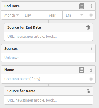
Right now, the “Sources” field under the “End Date” field looks a lot like the “Source” field under “Start Date,” but they aren’t really the same. Is there a way to visually differentiate the two types of field? Maybe label the subkeys a little differently? e.g., prepending a colon or adding the entire prefix, so the subkey is labeled “:Source” or “Start Date:Source”? Or, maybe just indent it even a little more?
The button that has to be clicked is the book, although the exact icon might be changed. The reason to put the source button on the header row of the field is the same reason for putting the “info” button on the header row: it is something every field has, so I thought it would make sense if they were on the same line. The + button creates the edtf subfield, that only the start_date and end_date fields have, so that button is on the input row of the field.
Also, the input row really varies depending on which type of field it is in: combobox, text, etc, so adding a button to each one of these would be more complicated.
All of the source fields really look the same! What do you think of renaming the subfields this way:
I’m doing roads in West Texas and I’d like to see something where various dates & names can be added to a segment, instead of drawing out multiple versions of the same road segment. Case in point: RANCH TO MARKET ROAD NO. 690
After looking at it a little further, I like the way the additional items are labeled “Sources for [tag]”. I was thinking just “[tag]:source” would be fewer words, more direct, but I also think there’d be room for confusion.
On that point should we have something like this for the regular old “Sources” field, to show what that tag actually means? Something like “Sources (for the geometry)”?
Also, why not just make all the form fields flush left? These fields may be long and they’re already indented, so maybe preserve as much room as possible?
There was some discussion a while back about what source=* means:
Personally, I think we should continue to treat source=* as just a generic, umbrella source for the feature as a whole. A great many features are traced from aerial imagery while cross-referencing external sources for the feature’s existence. Otherwise, explicitly limiting source=* to geometry would leave us with no generic replacement; we might discourage mappers from tagging a relevant source at all. One option would be to move the main Source field to the top, and add an optional Geometry Source field. This would keep the field from serving too many purposes at once.
When you say “flush left” are you referring to the “Sources for [tag]” field having a smaller width and being centered under the main field? Or are you referring to all of the form fields in general? The way I see it, the fields already flush left, both the field label and the text inside the input, but I might not have understood your suggestion haha