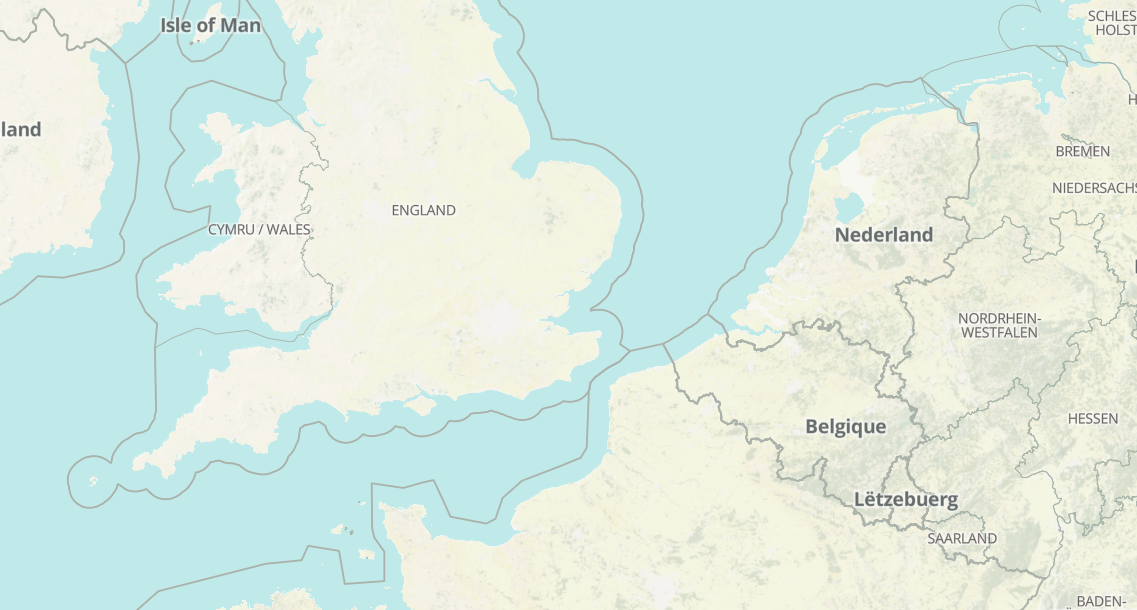
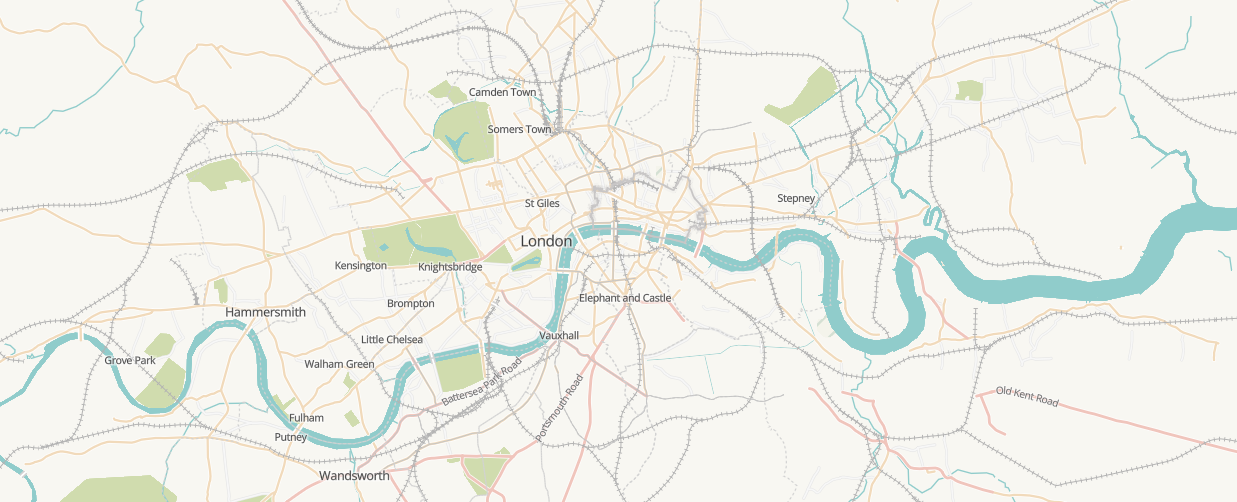
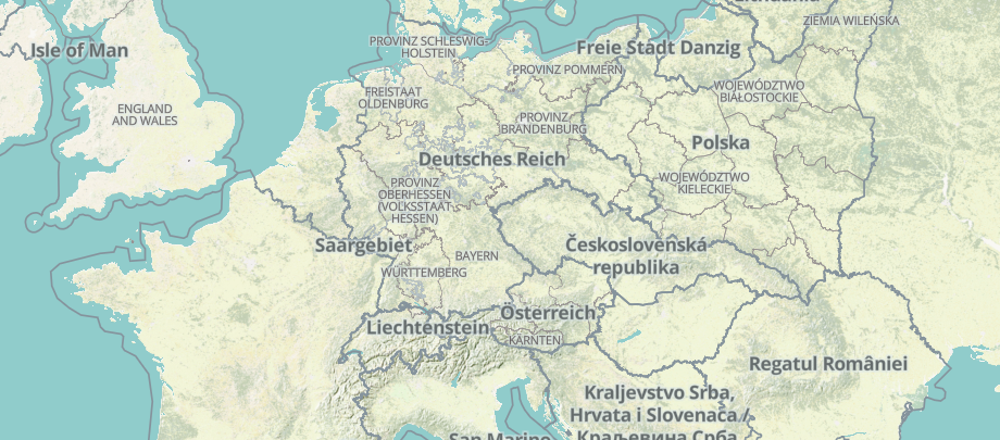
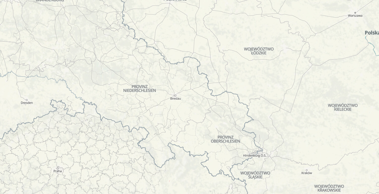
The test style can be reviewed here
I am looking for some design feedback from the community!
I am particularly interested in feedback on the railroad changes, and welcome other feedback as well. It would be great to know what data people are actively thinking about and mapping often, in the event that is relevant in future design updates.
Overview
I have created some style updates based on conversations with OHM team, which begin with the need to improve road contrast in residential roads (#554). That expanded to update primary and motorway link roads, and the prominance of those roads and need to balance them appropriately with other elements of the map near roads meant considering other visual hierarchy contrasts across the map.
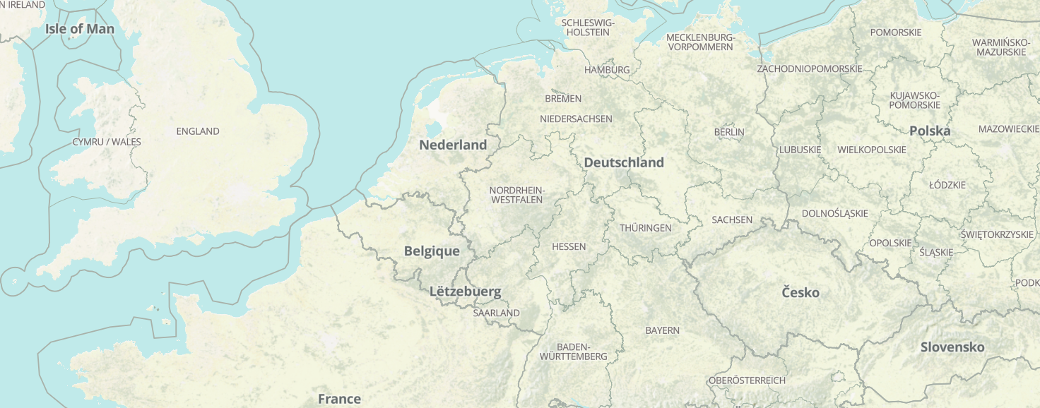
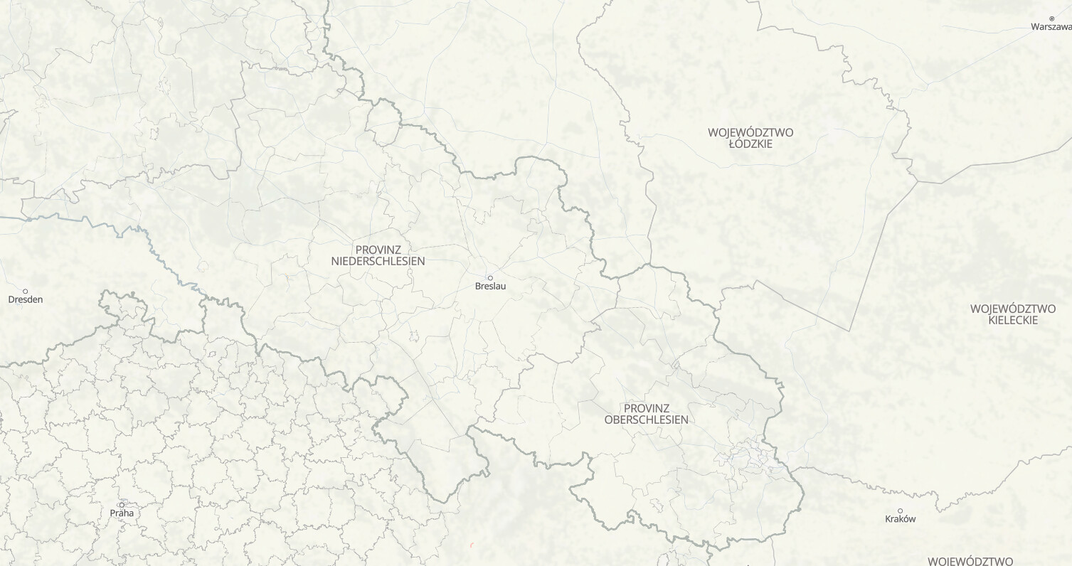
GreenInfo Network discussed some of these visual hierarchy considerations with OHM for the basemap in our last meeting a few weeks ago - noting water color needed changing to help alleviate some contrast balance, and also began conversations about removing some gray from the basemap colors. Conversations at that point discussed considering changing rail from a gray tone to a blueish-gray tone. Adjusting tonality helps shift a dark/heavier gray to becoming something that blends into the basemap more… while still holding enough contrast as a distinct element to be distinguishable and notable. The map has gray tones in other elements of the map, so I also considered where else I could remove gray tones from: the largest visual contrast element in the map with gray tones are administrative boundaries, so I also adjusted the admin lines to have more of a green-gray tone. The green-gray works well with the terrain overlay (which brought in a lot of green to low and mid level zooms).
I utilized zoom based styling to make considerations for all visual hierachy considerations. For example - road contrast considerations has casing removed at mid-level zooms, and the primary and motorway roads shift to a darker color at mid level zooms (that still balances with the rest of the map). As you zoom in, the (darker) casings appear and the primary and motorway roads shift to a lighter color. I tested the best time to bring in the casing so that the visual adjustment felt “natural”.
Similarly, I removed rail tick marks at mid zooms and brought them in at higher zooms - the visual clutter/contrast was improved (alongside the tone adjustment to a blue/gray for main rails). Additionally, I adjust the tick mark gaps so that the tick marks had a little more “breathing room” for main rails.
With the above considerations in mind, please read the below
Style changes
Road Contrast
Changes address #554
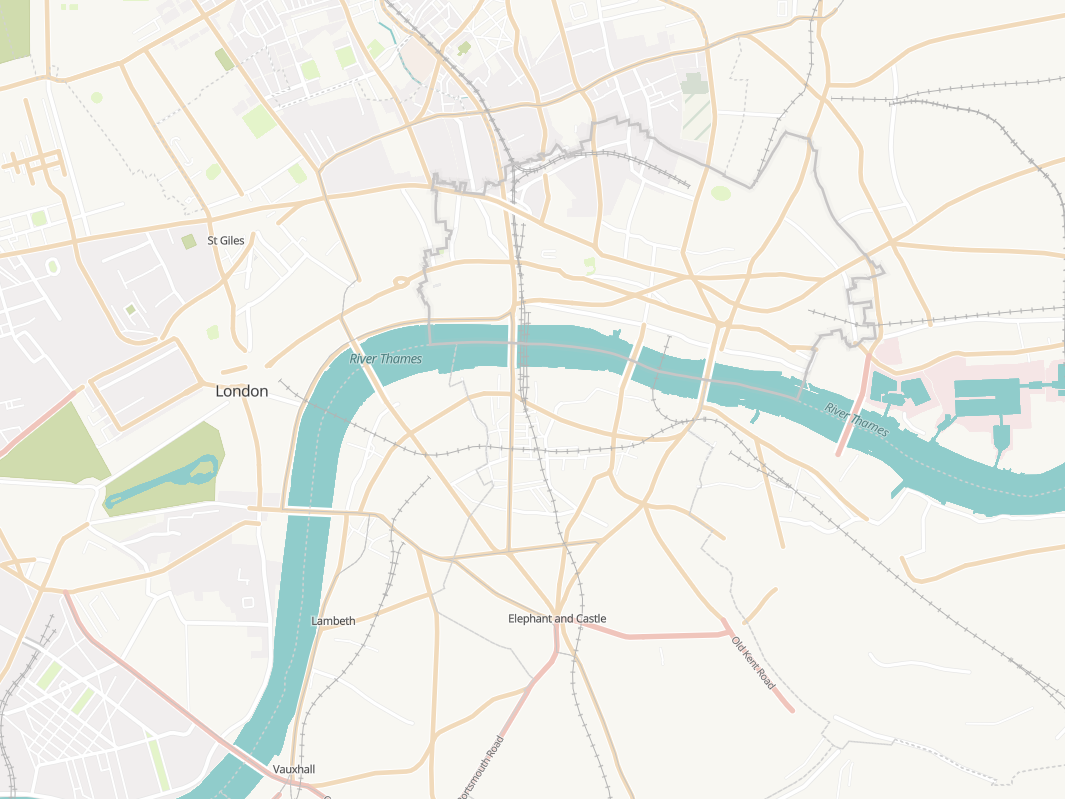
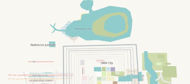
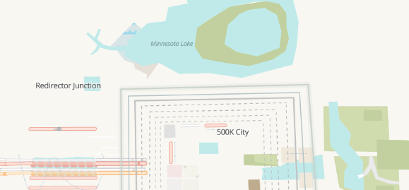
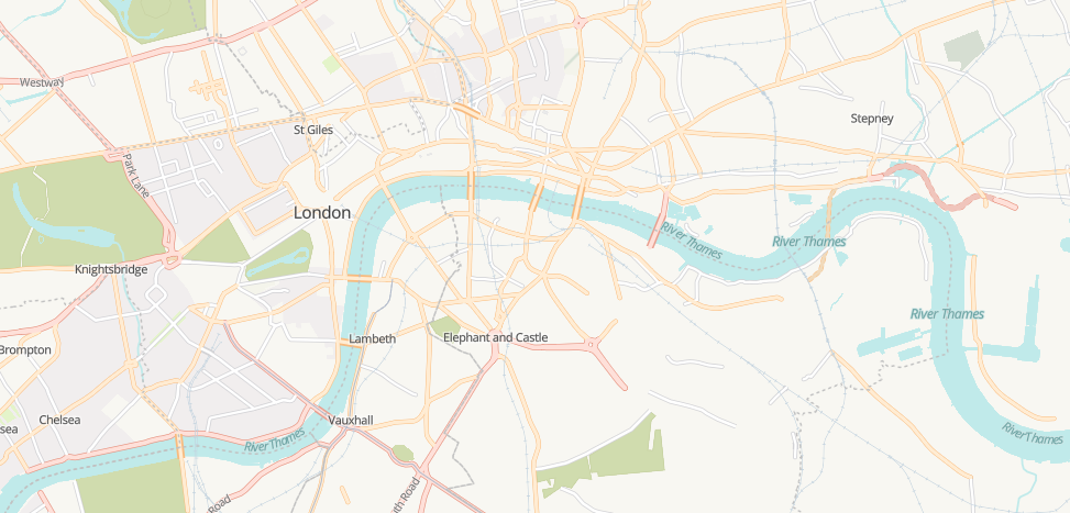
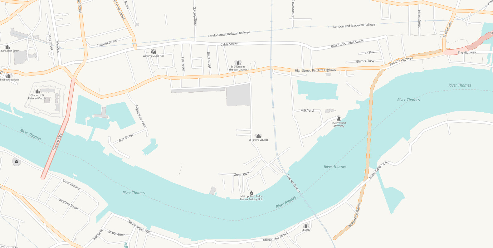
As noted above, non-primary and motorway roads received a contrast adjustment. They now have slightly wider casing, and a lighter gray casing color. The wider casing provides enough visual contrast to help improve visibility, and the lighter gray change helps ensure the non-main roads do not rise in prominance in visual hierarchy.
Per conversations with OHM, I adjusted primary and motorway roadways by changing white casing to a darker casing - darker version of the primary and motorway roadways, respectively. This initial adjustment caused primary and motorway roadways to be too visually prominent, so I had to adjust colors to both the casing for primary and motorway as well as the colors of the primary and motorway roads themselves: I made them lighter than the current OHM orange/red colors. This helped ensure that the overall map remained balanced, and did not bring the roads into more visual prominance (which would be okay for a road map but not this main map).
I tested the map at all zoom levels, adjustments made with casing per what made sense for visual hierarchy styling across all zoom levels. As noted earlier, I removed casing at mid-level zooms. I also adjusted colors for primary and motorway roads and provided zoom level based styling: at mid-level zooms, the primary and motorway roads themselves are darker, and after mid-level zooms, the casing “turns back on” and the primary and motorway roads themselves turn lighter. Visually, this is not jarring: I tested at what zoom level it was appropriate to do so.
Water Color
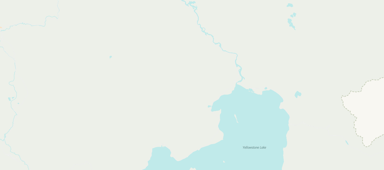
I adjusted watercolor: lighter. Making the water color made sense alongside considerations for visual contrast, as was discussed in our last OHM meeting. After a lot of color testing, the main area where adjusting water color (and clashing/lack of legibility) was some green spaces - in particular, nature reserve. I adjusted the nature reserve color (see above in Yellowstone) to a different green, and tested globally (currently only other nature serve I could find is a small area in Mexico) so this green adjustment does not affect anything, and helps make changing water color easier.
This new blue is lighter so allows for easier “stacking of future data” on top, as more data comes in, this will be helpful.
Railroads
Rail is currently very visually prominent on the map because of the gray tones as well as the ticks, as noted in Overview.
Also as noted in the Overview, I adjust the gray to a more blue-gray tone for most rail-related layers, and also adjusted when the tick marks show up (not at mid zooms), and increased the spacing between tick marks for normal rail layers (not mini rail):
- We will want to get feedback from OHM users on this rail adjustment (such as Natfoot in Discord)
Admin boundaries’ color (and label halos)
I made this adjustment based on conversations we had about there being a lot of gray in the map, and how making some minor adjustments would improve some contrast balance. At low and mid-zooms, the admin colors are a gray-green color, which works well with the underlying terraining. Upon zooming into to higher zooms, it adjusts to a more gray-leaning green-gray color, but still is a little less contrasted than the existing version (see above comparisons). Live link review required for all of these, but especially this one, as images shrink sometimes to fit the ticket.
I found #207 and #279 for previous admin boundary conversations (and I am sure there is far more history than that!). Let me know if gray is preferred for admin boundaries, and then can remove this from the general update if gray is preferred.
While looking at admin boundaries, I also noted that admin halos could be adjusted slightly, so changed halos to white in order to remove some gray as well
