Operator- extent of various ownership’s rail networks at different times, consolidation and break-ups are especially poignant to depict cartographically
Electrification- Interurbans- so many of these long-forgotten and difficult to relocate their original right-of-ways, but interesting to map for posterity’s sake and impetus for new light rail possibilities in current urban planning
Track gauge- interesting to know what was narrow gauge, when lines were upgraded or never upgraded
Infrastructure- i am very interested in original alignments, subsequent re-routes and realignements, station locations, spurs/branches/sidings, abandoned routes
Signalling is not a particular interest of mine - not a modeller/train orders person, more into the historical geography of rail network development and senescence, establishment of post offices, plats, hamlets, villages, towns, cities
I opened a github ticket that also shares the beginning discussions for the rail style - specifically for the design/aesthetics considerations that will happen alongside data updates. The design changes and updates will work in tandem with any data updates
I think probably the thing I’d like most on a historical railway rendering would be to show the stations more prominently.
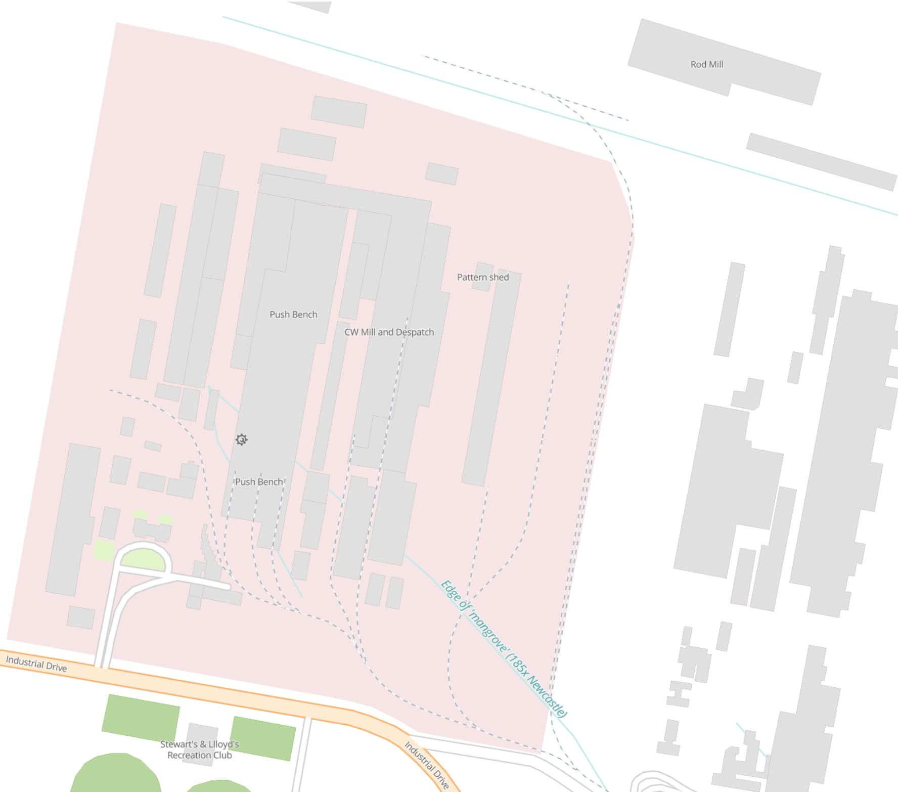
Also goods stations (perhaps mapped as railway=yard?) should feature on the map.
In addition to rail infrastructure, it might also be nice to feature things like factories (man_made=works) and mines which were connected to the railway and served by freight trains - which may help show how certain lines were used. I’m not aware though of any established tag to indicate this.
There are plenty of tags available for mapping facilities that railways serve but many have not been set up yet to render properly in OHM. This is an area I’m interested in (factories and mines) and on my job list to formally request the styling improvements. Here is a factory example: OpenHistoricalMap
Nice, track plan / illustration / drafting style. I like the integration with buildings- factories, mines, etc.- other shipping facilities. Sanborn maps have a wealth of detail on those often extant facilities.
Good fodder for a future 3-D render/gaming experience- back a train into the factory and load up, take-off, add some cars at another siding- train order delight!
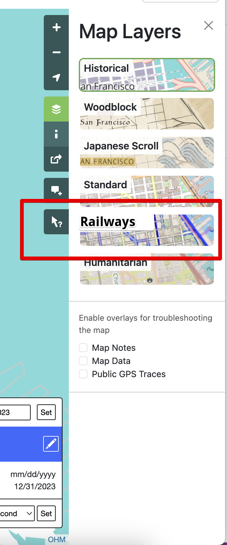
Just to be clear. Is this to develop the railway style that all OHM users see by default, or to create a syle layer that is optionally selected by the user?
If the latter then I’m all for it. If the former then the suggested styles seem too visually dominant (IMHO railways should not be more visually dominant than primary highways).
There certainly have been cases of this in history, but I assume these cases are outnumbered by cases where there were major highways without any railways. (Before a certain time period, major highways would’ve included stagecoach lines, wagon trails, turnpikes, plank roads, Roman roads, etc.)
I was mainly teasing @AndrewS_OHM that there were times when rails should have greater prominence than roads, and you bring a good point (at risk of thread diversion) about how significantly roads should be depicted in older times - e.g., yes, they were important connectors, but what % of the population actually used them & how frequently? Again, a good candidate for a separate thread!
and to add to the mix … shipping routes. Where I live there was no connecting road south to Sydney in the early 19th C and even after that was built through very rugged terrain the dominant transport for people and goods was by ship for many decades, then rail, then highways.
BTW we need shipping routes in OHM. Ferry routes exist but don’t render in OHM. Seamark=* has very specific shipping navigation details, but not a general shipping route. Some discussion of seaway=* on OSM but nothing solid. Are these best added to the Github issues list ?
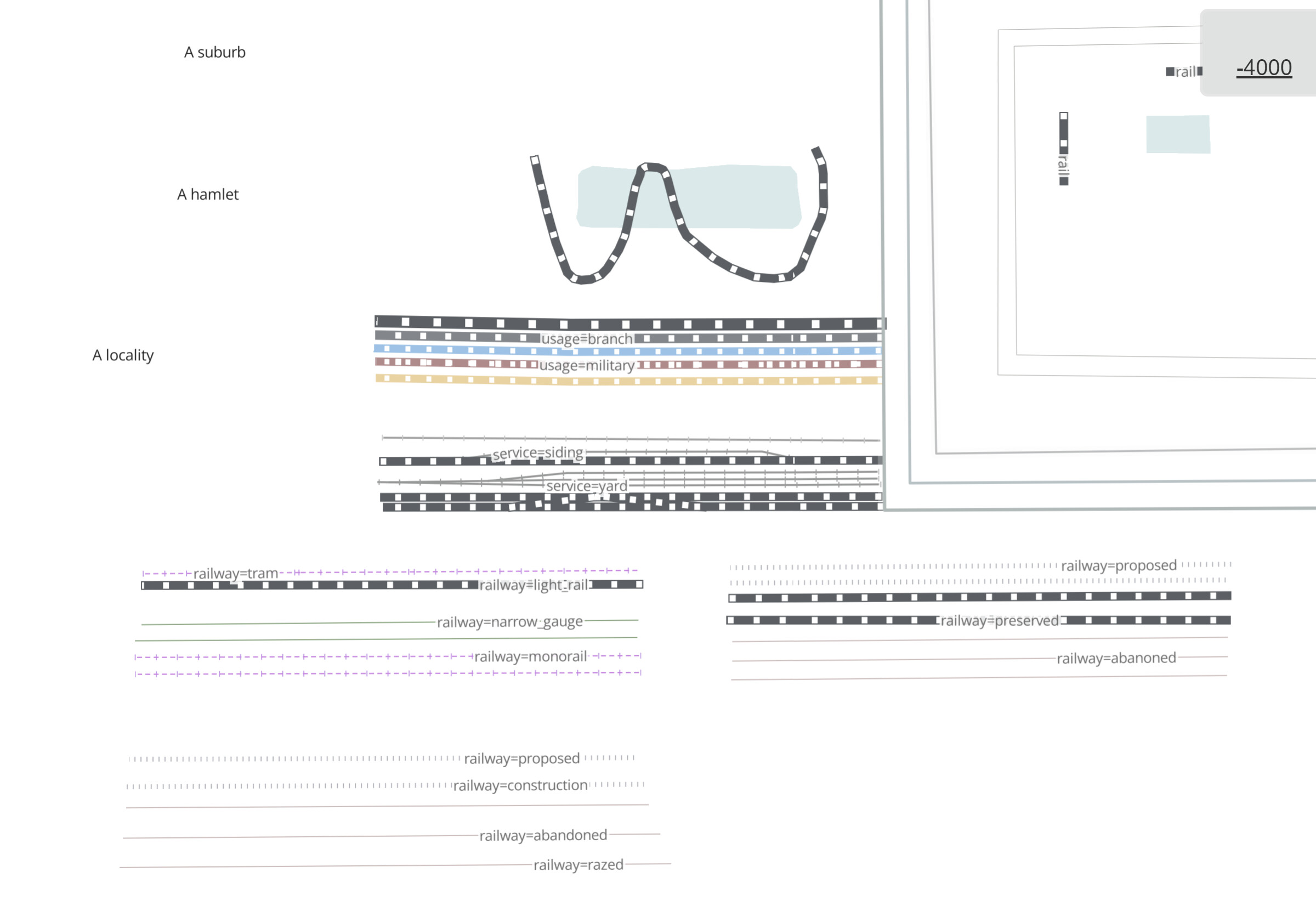
the white/yellow dotted lines indicate whether the line is electrified or not ;
the two black lines furthest to the right are for bridges and tunnels ;
tram;
light rail;
subway;
narrow gauge;
rail “usage”=“main”;
not displayed - rail “usage”=“branch”, appearance identical to narrow_gauge;
not displayed - rail “usage”=“industrial”, appearance identical to rail “service”=“yard” below;
rail “service”=“yard”;
disused;
abandoned;
rail “highspeed”=“yes”.
An alternative to dotted lines could be to use two colors, one dark and the other light.
As for names for “usage”=“main” or “branch”, a solution could be to display at a low zoom level only the “operator” tag and at a higher level the “operator” and the “name”.
As for “usage”=“industrial” and “service”=“yard” the simple display of the name at high zoom level would be sufficient.
At a higher zoom level, we could also display the type of electrification, gauge and the signaling.
I also recommend adding these tags to the rendered layers: operator, usage, highspeed, layer, gauge, frequency and voltage. As for railroad signaling, rather than using the Openstreetmap schema which is quite complex, I propose adding a “signaling” tag.
I do like this style, where each mode of transport has the same look to it, but just different colours.
Though I’m not completely sure about the electrification colouring, though I do like the idea of overlaying that information.
As for high-speed, I don’t think that’s something that needs to be displayed since what is considered as high-speed will change throughout the years. This is not an issue for OSM as they only need to know the current “rules”, but I think it can become problematic if that information was used in OHM with different “rules” for different time periods. I also think it would give a more uniform picture if that tag is just ignored.
Congrats and great work BUT (there’s always a but ) for usage=industrial the blue colour scheme is not showing unless the “name=industrial” tag is applied. The style is triggering off the name tag rather than the usage tag. Everything looks okay in the Greenland test area because each line is named “usage=xxx”.